HPE · UX Designer · 2020

One page, one subject

The same pattern again, this time across a whole page: unrelated marketing cut, the family-guide PDF folded into the tabs.

Skip to the numbers

Product clicks and CTA engagement, against the unchanged page.

  • 46.22%

    rate lift

  • 99.93%

    confidence

  • +22%

    scroll reach

A/B test · 50/50 split · 19 Nov 2020 – 23 Mar 2021

Role
UX Designer
Product
US Server Options page
Duration
Nov 2020 – Mar 2021
Shipped
Shipped · four months of traffic

Context

The first whole page I got to rebuild

This represented the first full-page redesign opportunity. The team initially planned three A/B test variants focusing on either content or software emphasis. Discussion evolved toward extracting PDF information while removing products, ultimately settling on tabbed content organization across all breakpoints.

The mess

The page had no main subject

Before the test, on the page as it stood.

  • 57%

    scrolled past the first section

  • 9%

    reached the portfolio module

Click analytics · hpe.com/us/en/servers/server-options · Sep – Dec 2020

The original page lacked clear focus with disconnected information and a low-performing PDF banner. The portfolio section appeared mid-page while another module sat at the bottom.

Analysis revealed 'HPE Servers' text links received unexpectedly high clicks — pointing to the 'Server Options Family Guide' PDF. The most-clicked 'SERVER OPTION PORTFOLIO' section suggested expansion opportunity by integrating PDF content while removing lower-engagement elements.

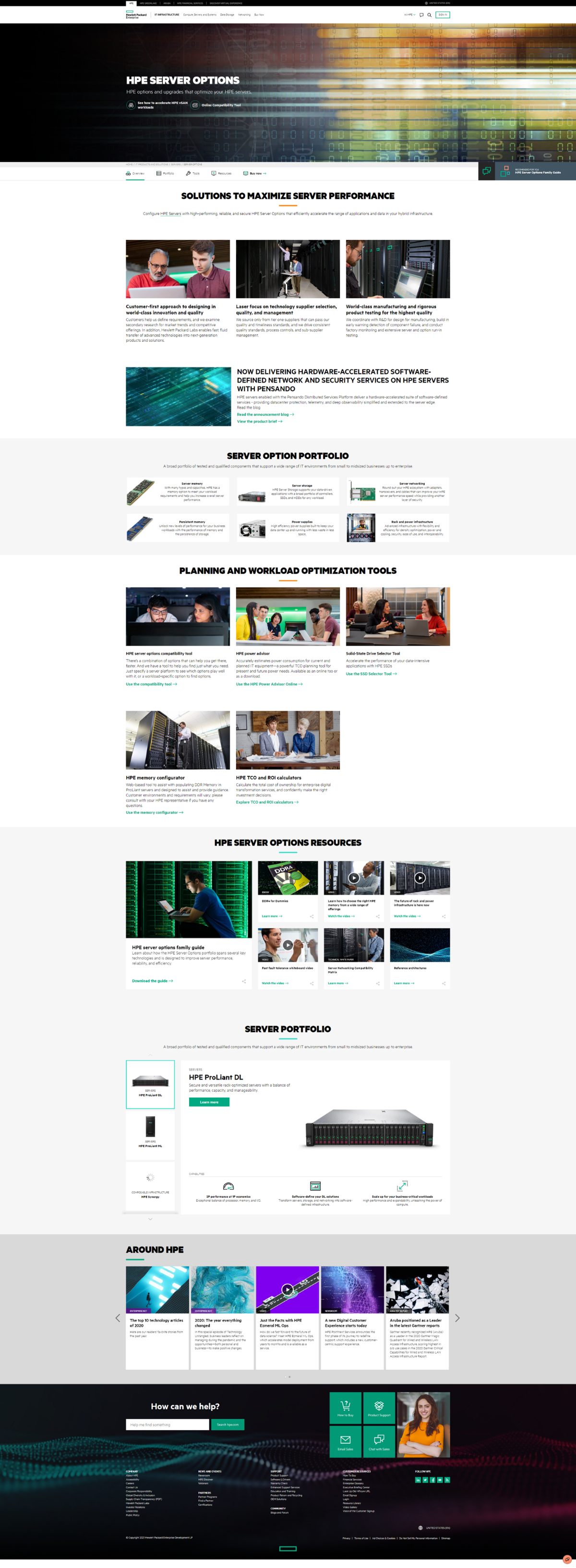
The original HPE Server Options page: a hero banner, three generic marketing panels, a Pensando announcement, the portfolio grid, a tools block, a resources block, a second portfolio block and an Around HPE carousel. Before
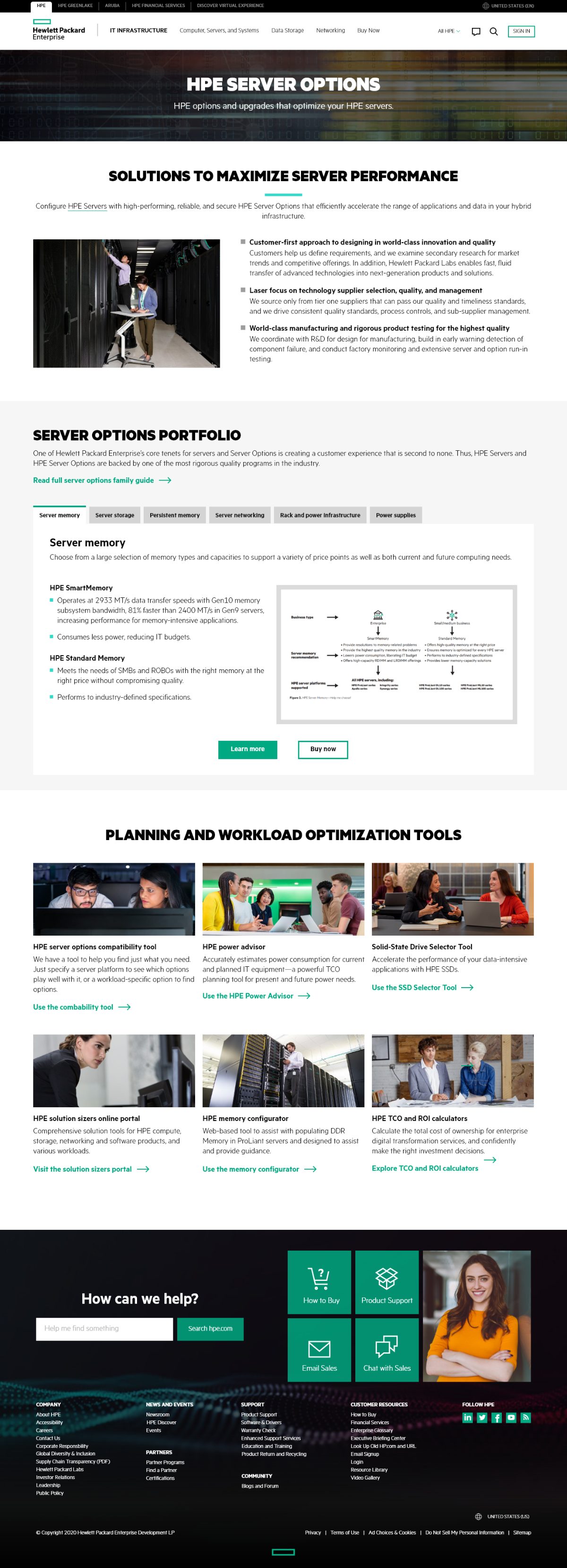
The redesigned page: one subject. The marketing panels collapse into a single supporting block and the whole portfolio moves into one tabbed module. After
Drag the divider. Left is what shipped before, right is what replaced it — same viewport, same scroll depth.
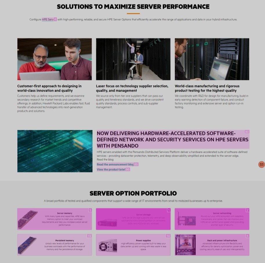
Analytics screenshot - attribution click data Sep-Dec 2020
The click heatmap that started it: interaction rank stamped on every block of the original page.

What I did

Cut the page down to server options

Rebuild the page around one subject

The designer extracted matching PDF information from the portfolio, integrated section images within tabs, added product option pages alongside purchase links, and restructured the performance section with cohesive visual treatment.
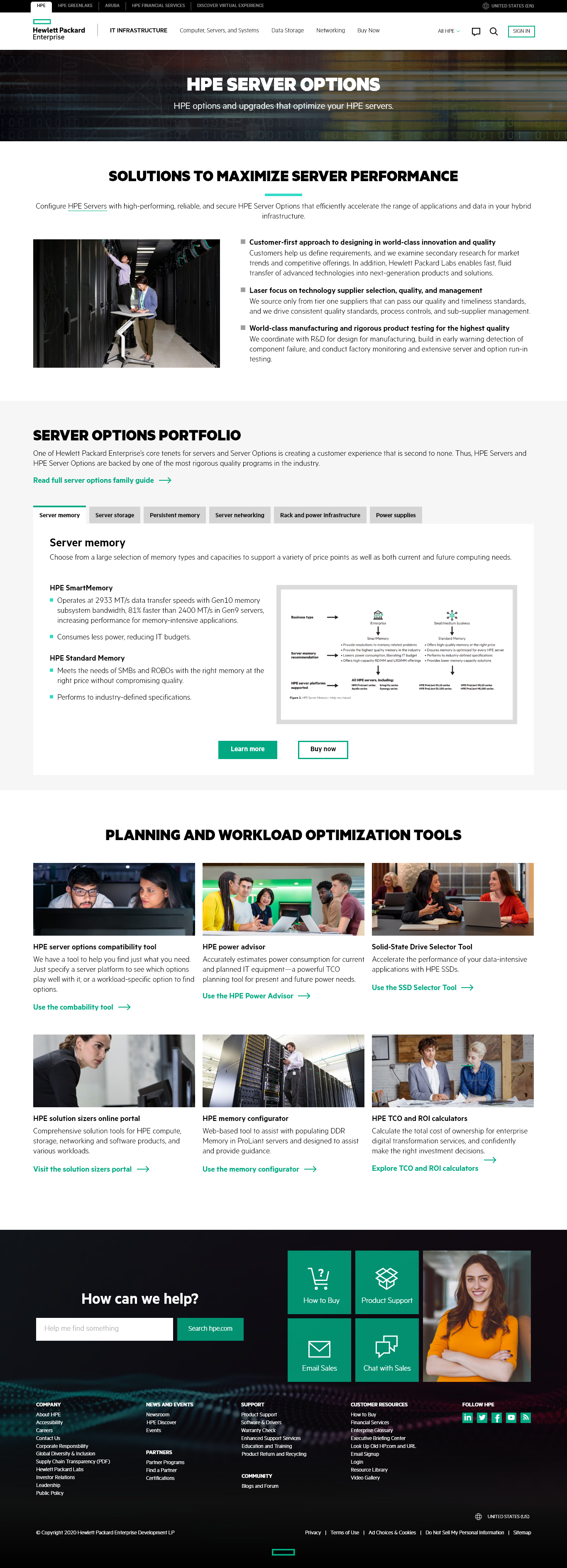
New simplified design
The redesigned page: server options only, portfolio in tabs.

Evidence

Four months of live traffic settled it

The current layout of the page seems to not have a main focus and there is too much content that does not correlate with each other. This page is supposed to be a gateway for other products, it should focus mainly on those products and an easy way to get to those products. By giving the whole page a redesign and having it focus on one main topic, the users should engage more and have a better experience while trying to find information relevant to them.

A/B testing would measure product clicks and CTA engagement.

Measured over four months of live traffic
Measure Result Confidence
Rate lift won 46.22% 99.93%
Conversion rate 87.16% 100%
Focus rate +12.7%
Average scroll reach +22%
Engagement score +1.3 points

A/B test · 50/50 split · 19 Nov 2020 – 23 Mar 2021 · US Server Options page

What shipped

It beat the component test it came from

Leadership confirmed results exceeded the initial tabbed component test, emphasizing the importance of conscious content curation for navigation ease.

Results demonstrate maintaining focused pages with condensed, clear modals improves engagement without content reduction. The designer expressed satisfaction that the tabbed approach effectiveness matched content-focus objectives.

Still open

Conduct additional page tests and recommend UX template updates.