HPE · UX Designer · 2020

The carousel that lied

Four category boxes on hpe.com all opened the same six-item carousel. I replaced it with tabs, tested it live, and won twice.

Skip to the numbers

Clicks into the section and into its CTAs, tabs against the live carousel.

  • +99.79%

    rate lift · tabbed

  • 99.92%

    confidence

  • 3.45%

    conversion rate

A/B test · session 2 · 8 Jan 2021 – 8 Feb 2021

Role
UX Designer
Product
Machine Learning Ops page
Duration
Dec 2020 – Feb 2021
Shipped
Shipped · still running

Context

Clicks went up. Almost nobody reached the content.

HPE's Machine Learning Ops page sells a container-based platform to enterprise engineering buyers, and it was a live page on hpe.com carrying real traffic. My week on the personalization team ran on a loop: pull the analytics for a slice of the domain, find a section that was underperforming, and test a replacement against it. Anything I proposed had to be built out of components the UX team had already shipped, and it had to survive a split test against the design that was already there.

The mess

Four categories, and the same carousel behind all of them

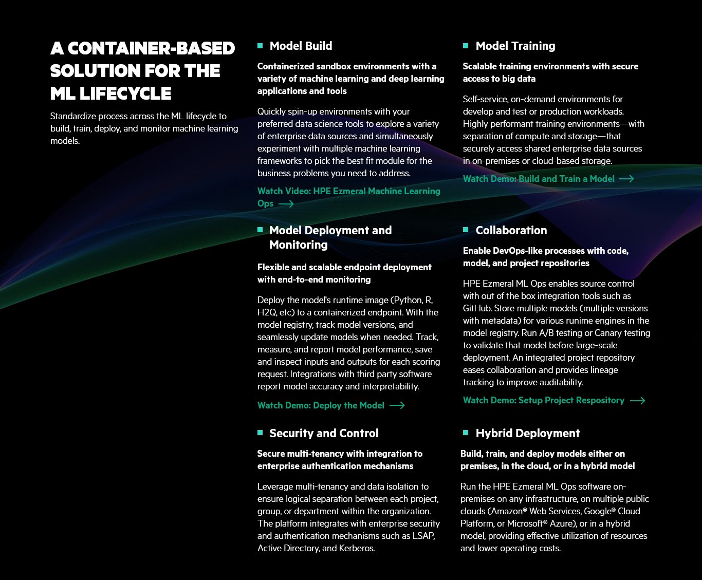
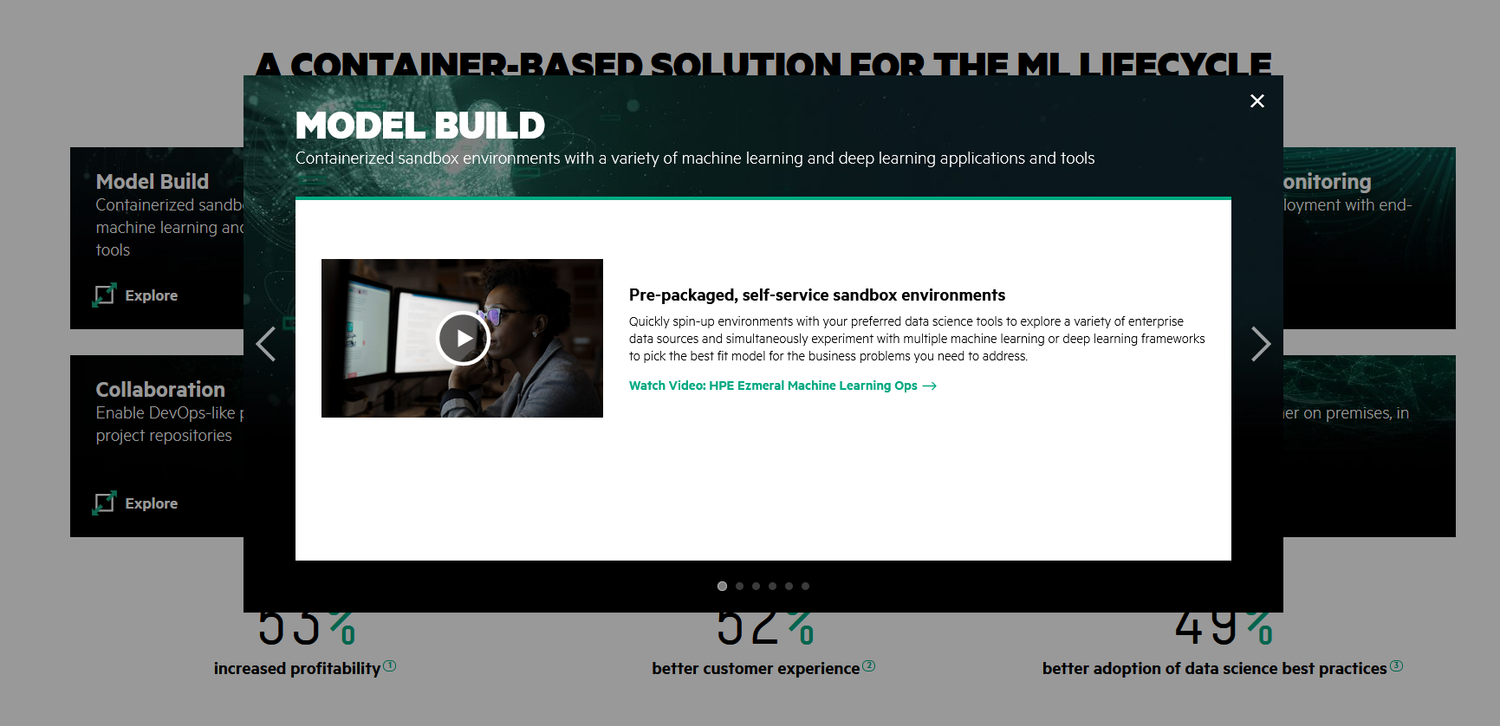
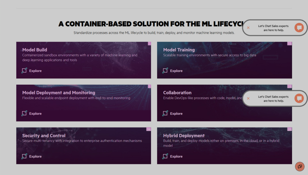
Four boxes sat under the section heading. Click one and a six-item carousel opened — the same six items, in the same order, whichever box you clicked, always parked on the first one.

The analytics said visitors were doing their half of the bargain: the boxes got clicked, and they ranked well against everything else on the page. What nobody did was scroll the carousel. Somebody who wanted Model Training clicked Model Training, landed on Model Build, and stopped there.

Nothing was actually missing from that page. Every video and every description was already on it — one click and an unsignposted scroll away, behind a control whose shape promised the click was enough.

Original layout - Open carousel state
Click any of the four categories and the same six-item carousel opens, always on the first item.
Original layout - Landing state
The original layout, with each box carrying its interaction rank.

What I did

Give every category its own tab

Give each category its own panel

The UX team had just put a tabbed module into the design system and nothing on the site was using it. I rebuilt the section on it: six tabs, one panel, and the panel changes when the tab does. No new component to get approved, no content rewritten, no scroll to guess at — the click finally returns the thing the label advertised. Every breakpoint was drawn, because the module had never been proven at any of them.
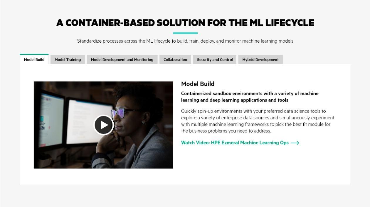
Variant One - Tabs desktop view
Variant one: six tabs, one panel, nothing hidden behind a scroll.

Test the opposite too, so a win means something

Laying everything out with no clicks at all had beaten hidden content on other HPE tests, and it is what the GreenLake page does. Run tabs against the carousel alone and tabs could win for the wrong reason — because anything beats a broken control. So the third variant expanded all six sections at once and forced the test to choose between two real ideas.

Laid out desktop mockup
Variant two: every section expanded, no clicking at all.

Evidence

Two sessions, and the tabs won both

The hypothesis, written down before anything was designed: people click one box expecting that box's content, get a carousel of everything instead, and give up. Make the selection do what its shape promises and click-through goes up.

An A/B preference test on live traffic. Three variants — the carousel, the tabs, everything expanded — scored on clicks into the components and into their CTAs.

A/B test results by session and variant
Session Variant Conversion rate Rate lift Confidence
01 Everything expanded 0.57% -87.83% 100%
01 won Tabbed 7.48% +62.15% 96.77%
02 won Tabbed 3.45% +99.79% 99.92%

A/B preference test · three variants cut to two · session 1 from 8 Dec 2020 · session 2 8 Jan 2021 – 8 Feb 2021 · 50% of traffic

What shipped

Tabbed views became the recommendation

Tabs won both sessions, so I took the numbers to the UX and data teams rather than filing them with my own. The designer who owns the ML Ops page did not end the test — he left it running at 50% and pulled the tabbed module into the redesign he was already scoping.

The results went up to our managers, David and Matt, and to Gabie Boko, VP of the digital team. What came back was a request to make tabs the default treatment on newly designed content-heavy pages.

I did not want a domain-wide rule resting on one section of one page, where the layout was not the only thing that differed between variants. So the next test moved the tabbed module onto another high-traffic page and ran it on its own, to find out whether the result was about tabs or about this particular carousel.

Still open

Two things I cannot claim from this. The tabbed variant's own conversion rate fell from 7.48% in session one to 3.45% in session two — the bigger lift is measured against a different baseline in a different month, and I never ran a clean holdout to separate the design from the season. And at the last measurement the test was still live at 50%: tabs were winning on that page, not shipped as a site-wide pattern.