Apryse · Senior Product Designer · 2026

Modernising a legacy desktop app

To address this issue, we brought churn data to leadership in order to win the case for a full redesign; as a result, we designed it to fit within the existing legacy Java framework rather than pursuing a full re-platform, which could have been costly and time-consuming. Prior to release, we tested with users to help ensure the experience felt seamless and intuitive, rather than waiting until afterward.

Skip to the numbers

  • 100+

    Survey responses on the new layout

  • 3.83/5

    Average satisfaction with it

Role
Senior Product Designer
Product
Xodo Desktop (PDF Studio)
Duration
2026
Shipped
MVP shipped · still iterating

Context

A desktop app on a Java codebase old enough to show

Xodo Desktop is the desktop member of Apryse’s broader Xodo suite, or cohesive ecosystem of products. Built in Java, the codebase seemed old enough that the interface had aged along with it over time. As a result, anything we designed needed to be buildable within that existing framework, or it simply was not going to be built at all.

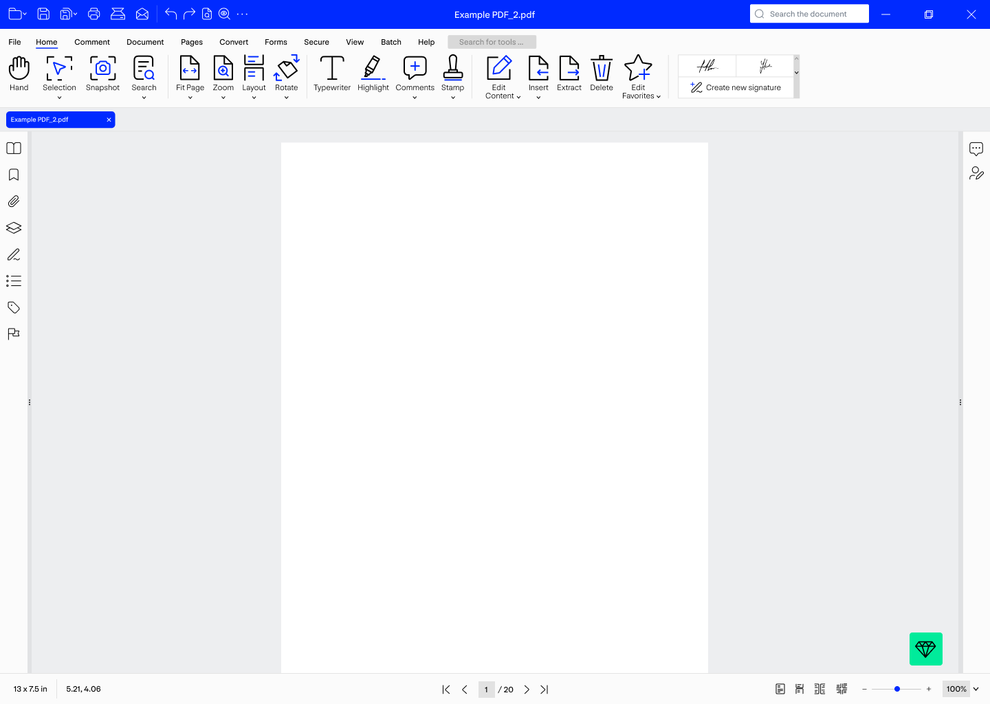
Xodo PDF Studio before the redesign: a saturated blue title bar and blue command strip above a single undifferentiated row of small icon buttons, with a narrow icon rail down the left edge. Legacy UI
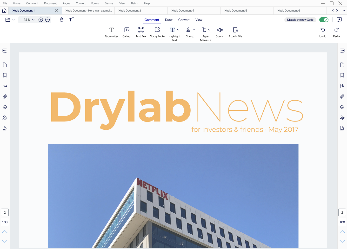
The same application after the redesign: a light grey menu bar, a document tab strip, and a tabbed toolbar with Comment selected showing eight labelled tools in one row. New UI
Drag the divider, or use the buttons above to see either interface whole. Same application, same window size — the difference is what the chrome is spending the screen on.

What I did

Won the argument with data, then designed to the constraint

Learned the framework’s limits before designing

Prior to beginning the redesign process, we recognized that the product's Java FX and Swing foundation, being part of an acquired codebase, seemed to place fairly significant limits on what could even be proposed. As a result, we spent the early weeks of the project working to understand what the framework could and could not reasonably support, leveraging AI tools to help us get up to speed on an unfamiliar stack more efficiently, which in turn allowed us to bring better, more informed questions to engineering sooner rather than later.
Led with churn data

In light of the fact that a proposed redesign could be easily dismissed as simply a designer’s opinion, we made the decision to lead with churn data instead. This data seemed to suggest that the outdated experience may have been contributing to a significant portion of user attrition, and that the appropriate fix was a full pivot. As a result of this insight, leadership’s position on the redesign ultimately shifted.

Designed to the legacy framework

After winning the argument for a full pivot, the natural next step could have been to pursue a full re-platform, though this approach seemed likely to be both costly and time-consuming. To address this, we designed the modernization to work within the existing legacy Java constraints, collaborating closely with engineering to identify workarounds in the instances where the framework was not necessarily able to support what the design called for. In this way, the constraint itself became a key driver of the overall design direction.

Gave the app somewhere to open other than a document

Upon observation, we found that launching Studio dropped users directly into the document viewer with no document present, which could be seen as a less than seamless first impression. The app appeared to show users where a file should go, while leaving them to work out how to get one there themselves, and in addition, every tool it offered sat behind a menu that a user would already need to be familiar with in order to find it. To address this issue, the new UI was designed to open on a home screen instead, surfacing recent files alongside the six most-wanted jobs, named clearly as tasks, in order to create a more user-friendly and intuitive starting point.

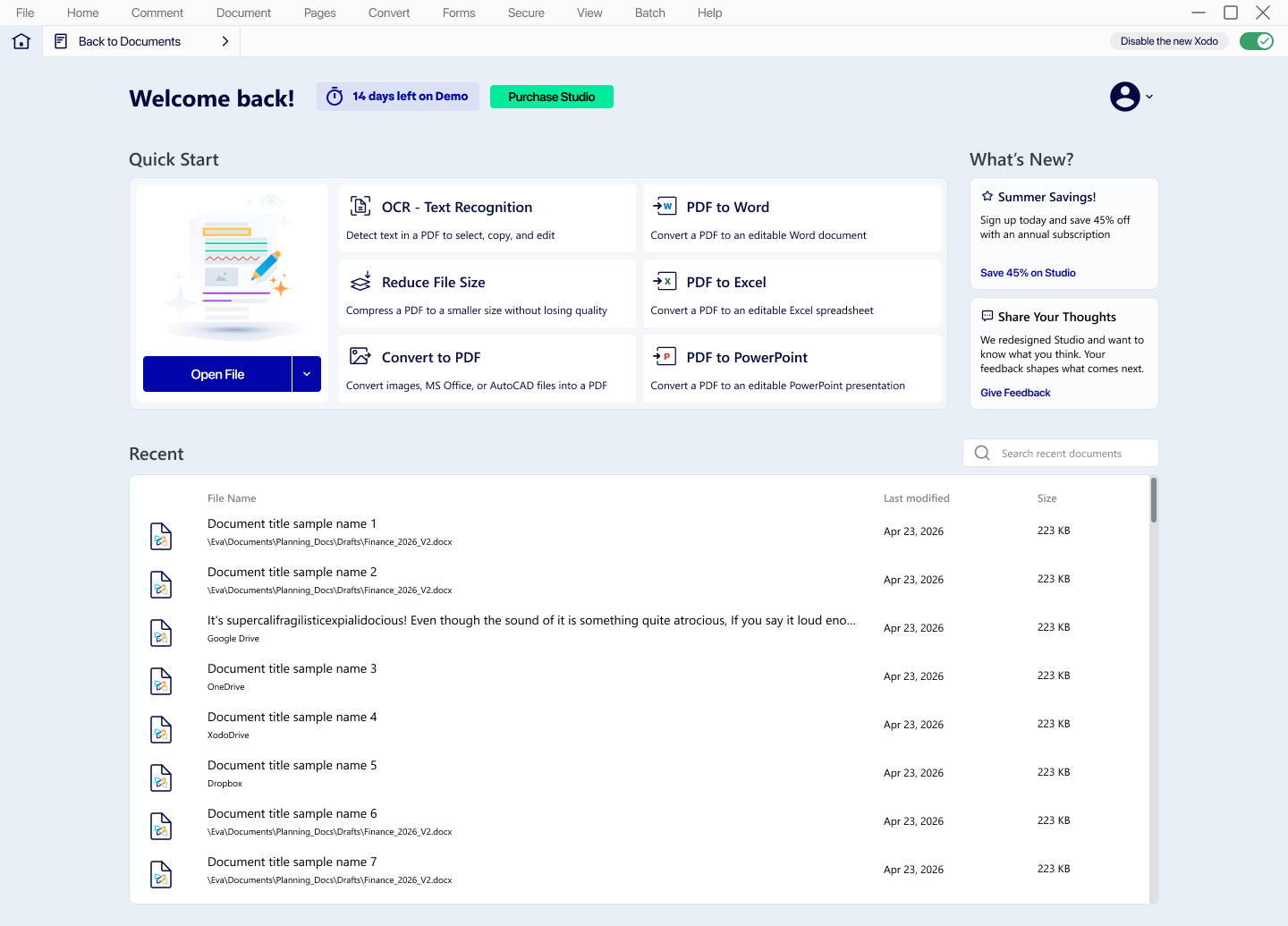
The new Xodo PDF Studio home screen: a "Welcome back" header, a Quick Start grid of six named tasks including OCR, PDF to Word and Reduce File Size, a searchable Recent files list, and a What’s New column.
The new home screen. Recent work on the left, the six most-wanted tools named as tasks, and a way back to the document viewer whenever there is a document to go back to.

Closed a demo that never ended

Upon analysis, we found that older versions had shipped with a bug that allowed the demo to run indefinitely, meaning that anyone still using those builds effectively had access to a paid product at no cost, which was not necessarily sustainable from a business perspective. To address this issue, we introduced a gate at the end of the trial period: once the demo expires, the product stops functioning and presents the three available paths forward, namely signing in, subscribing, or entering a perpetual license key. Throughout the trial, the banner communicates the countdown transparently, so that the eventual lockout is never a surprise to the user, which we believed would help preserve trust and overall satisfaction.

In addition, this fix needed to function seamlessly across both interface shells, as the redesign was still mid-flight while the revenue leak remained live. As a result, we built the gate as a single shared component that both the old blue chrome and the new interface could host, which ultimately allowed this revenue fix to ship on its own schedule, without being held back by the broader redesign timeline.

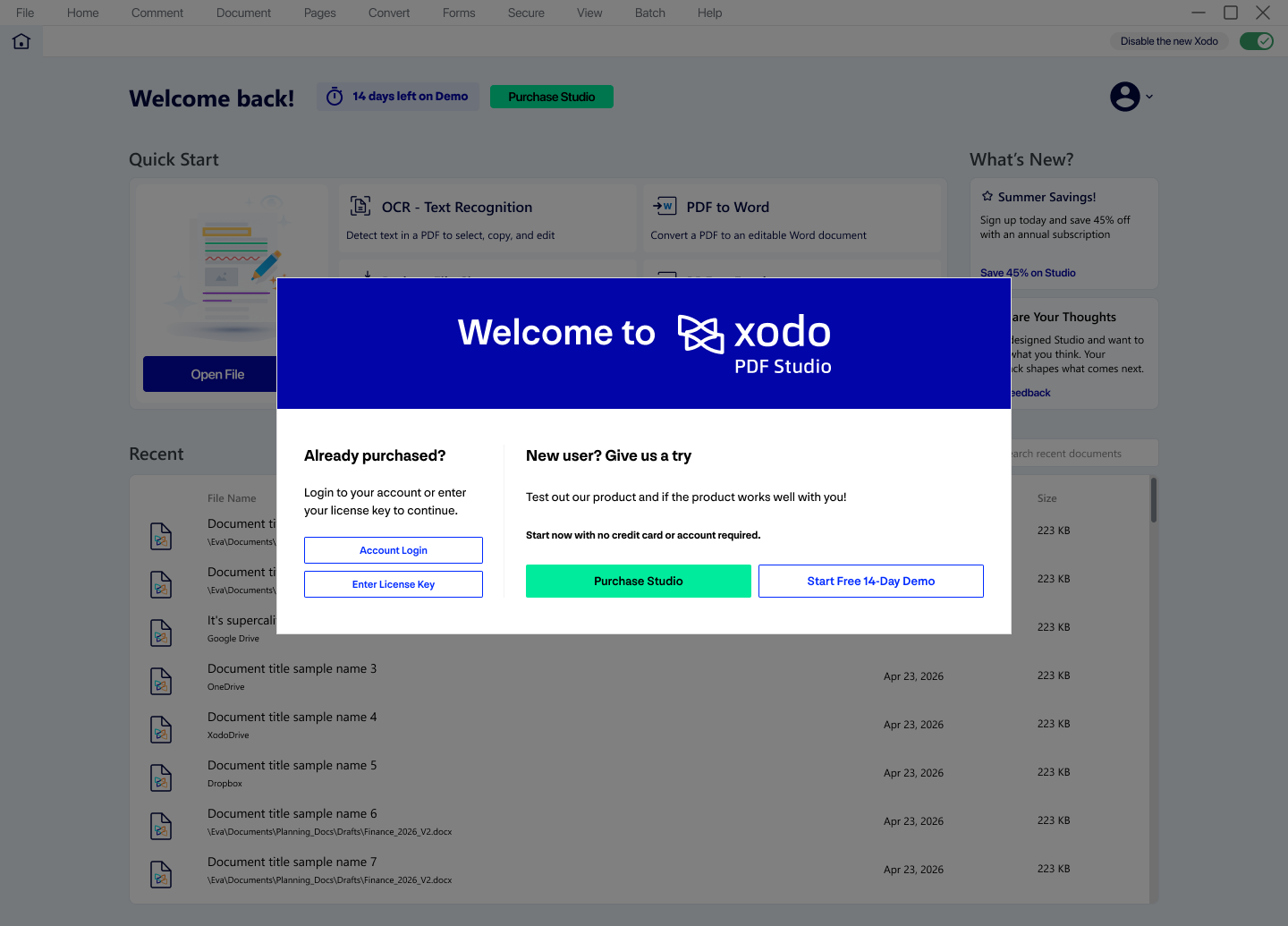
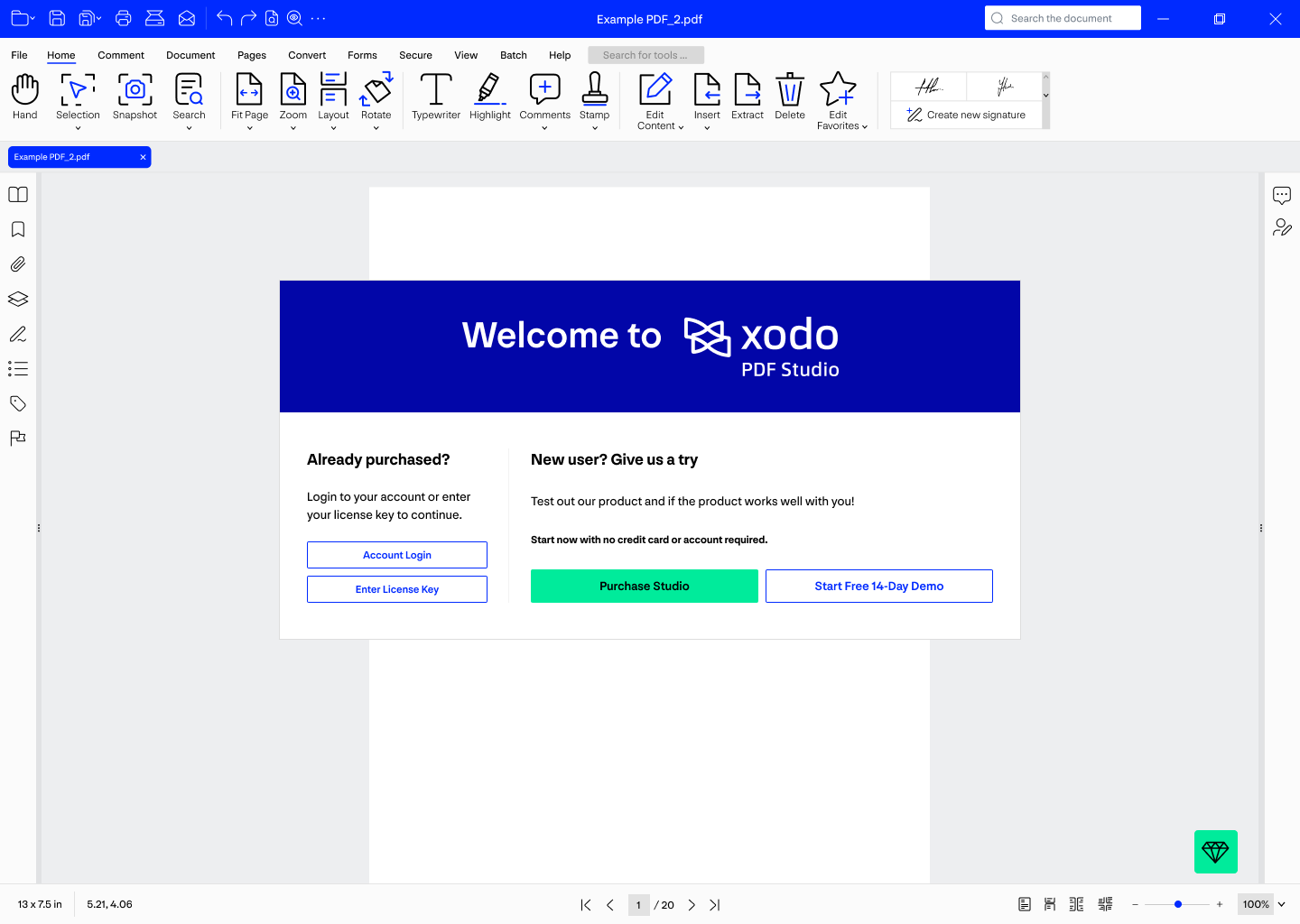
The demo dialog over the old Xodo PDF Studio interface, which has a bright blue title bar and toolbar. The dialog offers Account Login and Enter License Key on the left, and Purchase Studio or Start Free 14-Day Demo on the right.
The gate in the old UI. Two ways back in for people who have already paid, two ways forward for people who have not.
The same demo dialog over the redesigned interface, which uses a light grey menu bar and shows the new home screen behind the dialog instead of an empty document view.
And in the new one. Same dialog, same copy, same three exits, which is what let it ship before the redesign was finished.
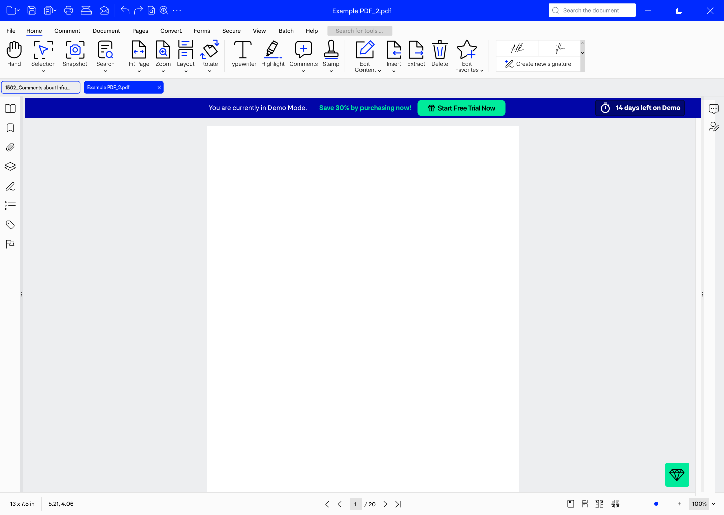
The old interface with a blue demo banner across the top of the document area reading "You are currently in Demo Mode", a Save 30% link, a Start Free Trial Now button and a "14 days left on Demo" countdown.
During the trial the banner states the mode and the days left, so the lockout is something the product already told you was coming.
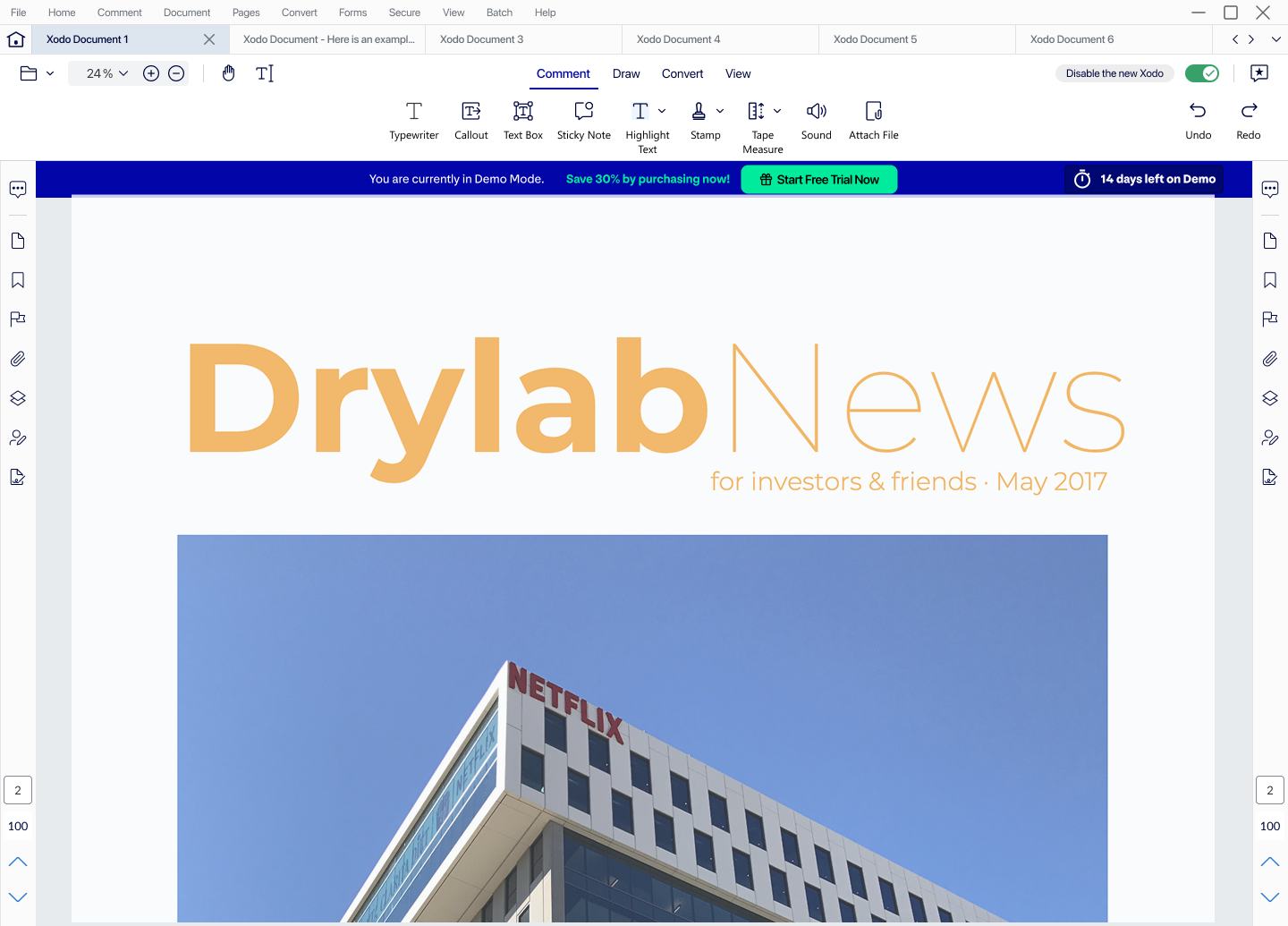
The redesigned interface with the same blue demo banner above an open document, beneath a light grey tabbed toolbar.
The same banner in the redesigned reader, sitting under the new toolbar rather than the old one.

Built an internal design system for the hand-off

As a result of recognizing that a redesign of this scale could easily drift if every screen were designed in isolation, we built an internal design system alongside the broader project, with components named clearly enough that a developer could hover over any element and understand what it represented. This was intended to function as a working library to support our own screens and to streamline the hand-off process, though we would not necessarily characterize it as a company-wide design system.

Evidence

Tested with real users before release

Prior to release, we pushed for additional user research. This product was being sold to people who had already indicated that it was hard to use, and shipping without first checking whether the redesign actually read as easier or more intuitive would have amounted to little more than a guess with a version number attached to it.

Given that Figma Make had just been released, we made the decision to prototype using it rather than wiring this many screens by hand, which seemed to streamline the process considerably. A working prototype took under a day to produce, plus a few additional hours to help it behave enough like a real application that participants could react to it honestly. In addition, we drafted the unmoderated script with the help of AI, working against a baseline we provided, and subsequently had the sessions transcribed and summarized, requesting timestamps on key pain points so that we could review those specific moments ourselves.

Over one hundred people responded to the survey, and rated the new layout favorably, though not overwhelmingly so: a score we felt was both solid and appropriately modest, which seemed right for an MVP, where the overall direction is correct even as the finer details remain unfinished.

What shipped

Modernised without a re-platform

Ultimately, the result was a modernized Xodo Desktop UI, seamless and intuitive, built entirely within the framework the product already had in place.

In our view, the part of this work most worth defending is the argument itself, more so than the screens produced. We made the case using data, and then delivered the solution within the existing constraint, rather than asking for the constraint to be removed, which we believe reflects a more pragmatic and business-conscious approach to design.

Still open

The churn figures that carried the argument, the workarounds themselves, and the screens are not on this page. Some of that is Apryse's to release, not mine.

Ultimately, a redesign the existing codebase could actually ship, which we believe helped drive a more cohesive and user-friendly experience overall.

Next case study

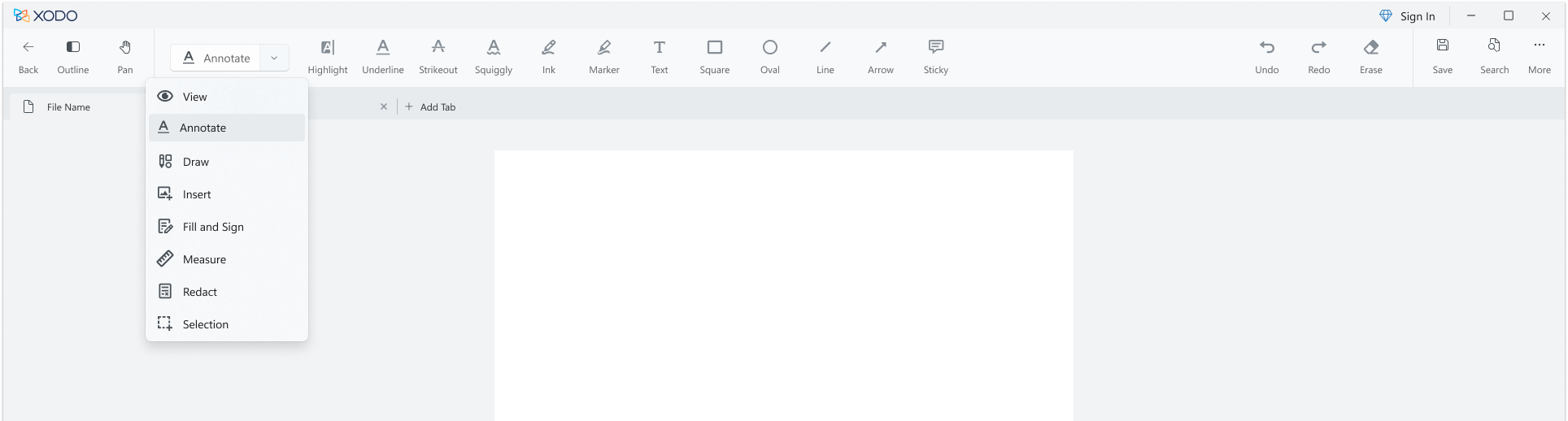
The redesigned Xodo for Windows toolbar: every tool labelled, the most-used ones first in the row, and a category menu open on Annotate.
Apryse · Xodo for Windows · 2023 Redesigning a toolbar that hid its own tools The native Windows toolbar showed nine icons and hid everything else behind an overflow menu. I made every tool visible, labelled and one click away. −2 clicks per task