Apryse · Product Designer · 2023

Making the SDK toolbar configurable

Prior to this initiative, the SDK toolbar was locked to the top of the window, which meant that a significant portion of customers had already rebuilt it themselves in pursuit of a more seamless and intuitive experience. To address this issue, we made the toolbar configurable and authored the guidelines that engineering ultimately shipped it from.

Skip to the numbers

  • 70%

    Customers who had modified the UI themselves

  • 3% → 5%

    Trial to paid, quarter after launch

  • +41%

    Revenue, Q1 against the prior Q4

  • 4

    Categories in the hand-off guidelines

Role
Product Designer
Product
WebViewer SDK
Duration
Jun 2022 – Jan 2024
Shipped
Partly shipped · floating toolbars paused

Context

70% of customers were already rebuilding the toolbar themselves

Apryse's WebViewer is a document SDK that other companies embed within their own products, meaning that, in order to provide a seamless and intuitive experience, its interface needed to feel cohesive with each host product's look and feel. Upon observation, we found that this was not necessarily the case, as the toolbar was fixed to the top of the window in a fixed order, which we believed could be improved to better support a wider range of customer needs.

As a result of this limitation, the impact seemed to be felt in two distinct ways: prospective customers appeared to back out during the evaluation process once they realized their branding could not be matched, while the customers who ultimately stayed on filed support tickets requesting layout assistance or reporting issues within the work-around code they had written in an effort to force the desired outcome. In light of this insight, it became clear that this could be improved in order to drive greater customer satisfaction and loyalty going forward.

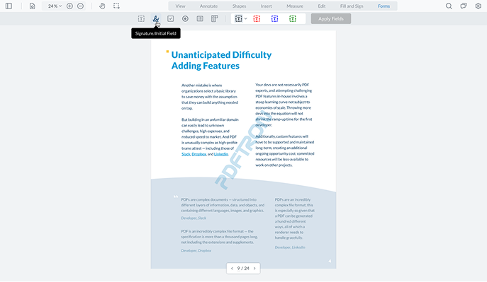
The old PDFTron-era WebViewer: two horizontal toolbars locked across the top of the window above the document, with no tools anywhere else.
Before. Toolbars across the top, in that order, and nowhere else.
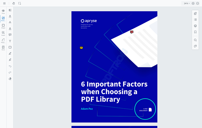
The redesigned WebViewer: a vertical tool rail down the left edge and a second panel rail on the right, with the document centred between them.
After. The same tools, moved: any edge, in any order the embedding product wants.

The mess

Customizable could mean anything, so nothing got built

Upon analysis, we determined that "make the toolbar customizable" was more of a general request than an actionable brief, as every position a tool could occupy represented a state that someone would need to build, document, test, and support indefinitely. As a result, much of our work involved deciding which freedoms could be considered worth their long-term cost, and, in light of this insight, drawing a reasonable line under each in order to strike a balance between flexibility and a cohesive, user-friendly ecosystem.

What I did

Every option shipped with a limit defined alongside it

Two ways to group tools

Upon observation, we found that grouping seemed trivial until we attempted to define it in practice: some categories had too few similar tools to be worth a group, while others had too many to remain readable and user-friendly. As a result, we ultimately arrived at two mechanisms. Tools could be laid out in place, where spacing alone carried the grouping, or collapsed into a drop-down, where the first tool became the icon and the remaining tools were listed with labels. In light of this insight, one mechanism was intended for groups we wanted to keep visible, while the other served groups we wanted to keep available, in order to drive a more seamless and intuitive experience overall.
Set a ceiling on the toolbars

In light of customer feedback, it seemed that customers wanted toolbars on all sides, at every breakpoint, and in any number they saw fit. Granted, this was not necessarily buildable in a literal sense, so we ultimately set a limit of two layers, with the inner layer able to be either full-width or floating, and tools overflowing into a drop-down once they ran out of room. Ultimately, we came to believe that this ceiling was what made the freedom feel genuinely seamless and intuitive for our customers.

Documented the rules for the hand-off

After observing that the hand-off process kept failing in a similar manner each time, we determined that developers were not necessarily able to attend every call, decisions had often been made months earlier, and the work moved between developers over time, which meant that the same questions tended to resurface while the answers largely lived within our own understanding of the project. To address this issue, we documented toolbar capabilities and organization as guidelines across four categories, which appeared to reduce the number of recurring questions and helped take some of the load off the broader team. Ultimately, on a project of this duration, we believed that an undocumented decision was likely to be made again by whoever picked up the work next, underscoring the importance of a cohesive, well-documented approach.

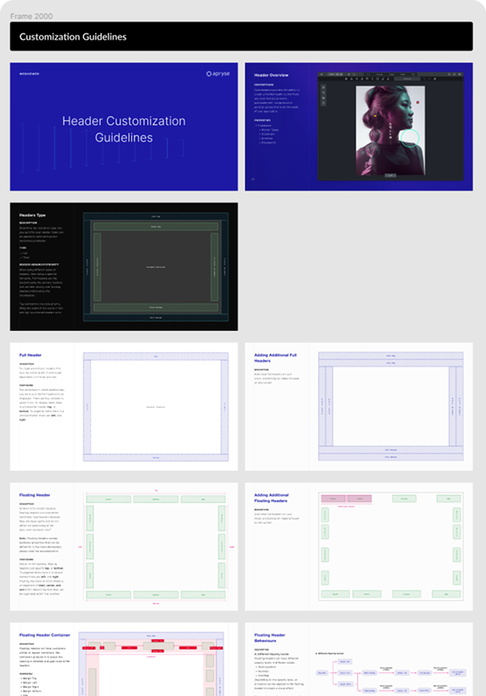
The Header Customization Guidelines document: a title board, a header overview, a headers-type reference, then annotated diagrams for full headers, adding additional full headers, floating headers, adding additional floating headers, the floating header container and floating header behaviours.
The hand-off guidelines. Every position a header can take, what it does at each one, and what happens when they combine, so the answer was a page reference rather than another meeting.

Evidence

A customer survey and a market scan, before any design

Prior to beginning any design work, we gathered two key inputs: a customer survey inquiring as to what customers had already done to the UI themselves, and a market scan examining how comparable products in the space handled their own toolbars.

The survey ultimately became the strongest argument for this work. A significant portion of respondents indicated that they had already built modifications on top of the WebViewer UI, describing the process as very time-consuming, and rated our existing options poorly overall. In addition, over half also shipped their products on tablet and mobile, which ruled out any approach that could only function at desktop width. Upon analyzing the market scan, we were able to determine which toolbar positions were considered table stakes across the industry and which could serve as a genuine competitive advantage.

What shipped

Two phases shipped, one paused, trial to paid up

Ultimately, the work shipped in phases and remains an ongoing effort. Tool categorization was addressed first, followed by the ability to place tabs wherever the product needed them. Floating toolbars in specific positions proved to be the most challenging phase, and, as a result, this portion of the work is currently paused.

What we were able to ship appeared to change the answer customers gave, as they were finally able to align the tools to their own product rather than to ours, which we believed contributed to a stronger competitive advantage. In the quarter following launch, trial-to-paid conversion appeared to improve by a meaningful margin against the prior average, and revenue increased by a significant portion in the following quarter, though we're not able to share the exact figures here. As a result of this work, our manager put us forward for consideration for a Senior Product Designer role.

Still open

The floating-toolbar phase is paused, not cancelled, and its design is done and waiting. And these are quarter figures, not a controlled test: other work shipped in the same window, so I will not claim all of that movement for one feature. What I will claim is that the thing customers had been rebuilding by hand stopped being a reason to walk away during evaluation.

Ultimately, we came to recognize that every option we added was not necessarily a one-time addition, but rather a state that engineering would need to support indefinitely.

Next case study

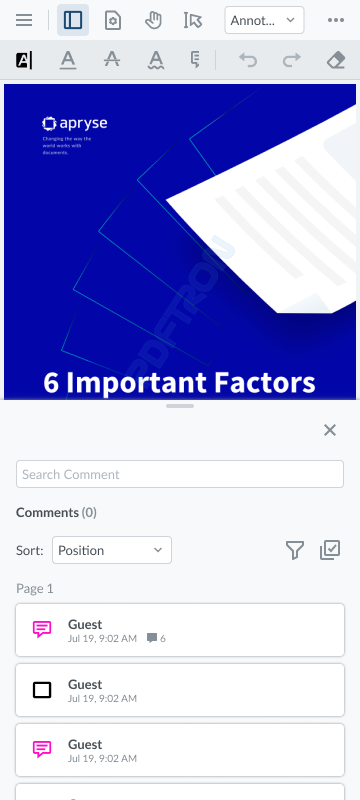
The redesigned Xodo comment panel on a phone, defaulted to half the screen with the document still visible behind it.
Apryse · WebViewer SDK & Showcase · 2022 Making WebViewer usable on a phone Full-screen panels covered the document on mobile. I audited the SDK and the Showcase across three platforms and traced every urgent problem back to one component. 40 client survey responses