Apryse · Product Designer · 2022

Half a screen back for the document

Full-screen panels buried the PDF on mobile. Three platforms audited side by side; every urgent problem traced to one component.

Skip to the numbers

  • 40

    client survey responses

    Survey emailed to all WebViewer clients · 2022

  • 3

    platforms audited side by side

    WebViewer SDK mobile view · Xodo Android · Xodo iOS

Role
Product Designer
Product
WebViewer SDK
Duration
Aug 2022
Shipped
Shipped

Context

One SDK, three platforms, no shared mobile design

The team aimed to improve mobile experience for the PDF SDK product, conducting user surveys and deep heuristic evaluation across WebViewer SDK's mobile view and Xodo's Android/iOS platforms. Key findings identified that panel design, popup modals, and tool use indicators required improvement.

The mess

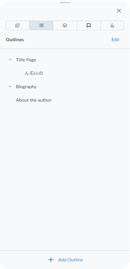
A full-screen panel hides the document you opened it on

In our study of the mobile experience for our PDF SDK product, we found that the experience across different platforms was similar, but not identical. While this is not necessarily a bad thing, we identified some areas where the design of the panels and popup modals in the mobile view could be improved to enhance the user experience.

The current design of the panels was not user-friendly and disrupted the flow of the user's actions. In particular, the full-screen panels made it difficult for users to interact directly with the PDF pages, which hindered their ability to use the product effectively.

The popup modals were sometimes too large, which obscured important information on the PDF. This did not affect the functionality of the tools, but it could be frustrating for users who were trying to view the PDF content.

BEFORE
Outlines - Fullscreen
The outline panel takes the whole screen and the document disappears.

What I did

Give the document half its screen back

Default the panel to half height, expandable

We implemented a panel defaulted to a half-screen view, allowing the user to expand and unexpand it as needed. This gave users the flexibility to interact with the PDF pages without sacrificing the ability to access the panel's tools and features.
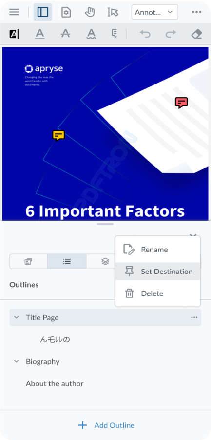
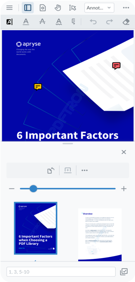
AFTER
Outlines - Half Screen
The panel defaults to half height, with the page still live behind it.
Page View - Half Screen
The same treatment on the page-thumbnail panel.

Fix the component, not every tool

Upon observation, we discovered that several tools categorized as 'urgent' shared a common component. In light of this insight, we concluded that it would be more beneficial to maintain the existing flow utilized by these tools while focusing on improving the usability of the specific component causing mobile responsiveness issues.

Evidence

Forty clients said the same thing

Although this number was less than half of the users that participated in this survey, we believed that improving the overall mobile experience would encourage more clients to use it. Additionally, we wanted to support our clients who had a high percentage of mobile users or native mobile apps to maintain their business with us.

Competitors prioritized desktop and tablet views while neglecting mobile user-friendliness.

What 40 clients said about mobile

  • Most common access: desktop only or desktop + mobile + tablet
  • No clients using solely mobile, tablet, or other platforms
  • On average, less than half of a client's user base uses mobile or tablet
  • Over half of the clients said they are not embedding WebViewer in native mobile app

Survey emailed to all WebViewer clients · 40 responses · 2022

What shipped

Responsive on mobile, in the SDK and in the Showcase

The results of our study of the mobile experience for our PDF SDK product were positive to the internal PDFTron team. Not all of the features have been fully fleshed out and designed yet, but we are hoping that clients and end users will find the mobile experience more enjoyable.

Still open

Other areas of the mobile experience this audit flagged were left for later rounds. What went out in 2022 is the responsive behaviour: the panels, the toolbar, and the document keeping half its screen.

Four states of the redesigned comment panel, side by side at full size: the comment list with every comment selected, the reply composer with the phone keyboard up over the half-height panel, the same composer with the panel expanded to full height, and the status menu open over the live page with Accepted, Rejected, Cancelled, Completed, None, Marked and Unmarked.
Four of the twelve states handed to engineering, at full size — select, reply, expand, set status.