Apryse · Senior Product Designer · 2026

Rebuilding the checkout for the whole suite

Every product within the Xodo suite was sold through one shared checkout, which, upon analysis, we recognized as both a considerable point of risk and a meaningful opportunity for growth. To address this, we rebuilt the flow and tested a range of variations with internal stakeholders, and as a result, the share of users who ultimately completed a purchase more than tripled, driving a meaningful improvement to the overall purchase experience.

Skip to the numbers

  • ~10%

    Purchase conversion, before

  • 32%

    Purchase conversion, after

  • 1 month

    Time to reach it

  • 1

    Flow, shared by the whole suite

Role
Senior Product Designer
Product
Purchase Flow
Duration
2026
Shipped
Shipped

Context

One checkout, and the whole suite sells through it

Xodo is a suite of PDF products spanning desktop, mobile and web, and each of these products was sold through the same shared purchase flow. As a result, we came to see this flow as both a single point of potential failure and a considerable point of leverage across the ecosystem: a shortcoming at any one step could impact every product simultaneously, while a well-considered improvement could pay dividends across the board. In addition, we recognized this as trust-critical work, given that a purchase flow represents the moment a product transitions from being free to asking the user for payment information, and, in light of this insight, we understood that it would likely only have one opportunity to seem seamless, user-friendly, and worthy of that trust.

One purchase flow shared across the Xodo suite Desktop, mobile and web products all route through a single shared purchase flow, so one change ships to all three at once. Desktop Mobile Web Shared purchase flow One change ships to all
Every product in the suite entered the same purchase flow. One path to fix, and one path to get wrong for all of them at once.

The mess

Drop-off concentrated on the account step, before payment

Upon reviewing the analytics, it became apparent that a significant portion of users were interested in making a purchase: clicks into the purchase journey were high, while completions were not necessarily keeping pace, and the gap between those two figures seemed to represent the core of the issue.

After tracing the drop-off further, we found that it appeared to concentrate around a single step: account creation. In other words, users who had, in effect, already committed to paying seemed to be stalling at the precise point where the product required them to first become a registered user, which could be seen as an unnecessary friction point standing between intent and completion.

Purchase flow before and after The original flow asked for account creation as the second step, where drop-off concentrated. The revised flow moves account creation to the end, after payment and confirmation. Before Click buy Create account Payment Confirm Drop-off concentrated here After Click buy Payment Confirm Create account
The original flow asked for an account before payment. The rebuilt one asks after confirmation, so the step that lost people is no longer standing between them and the thing they came to buy.
Purchase journey for a user without an account Three stages: checkout cart, create an account, and payment details. Account creation requires six separate fields. Amber marks capabilities not available at that point in the flow; coral marks data the user is asked to enter twice. Checkout cart Adjust seats Confirm plan No promo code field Discounts not shown Create account First and last name Email Company optional Create password Confirm password Accept terms Six fields before a decided buyer can pay Payment details Card details Full name Billing address Promo code Step in flow Not available here Data re-entered
What the account step actually demanded, field by field, at the point in the journey where it was demanded.

What I did

The variation people actually completed

Put the analytics into one scoping document

Given that engineering, leadership and marketing all had a stake in this flow, and yet none of these groups appeared to be looking at quite the same picture of it, we recognized an opportunity to bring greater cohesion to the process. To address this, we pulled together the analytics, the market analysis, the existing user flows and the metrics we were ultimately trying to move, and leveraged AI to help organize that collection of inputs into a single scoping document, rather than allowing it to remain four somewhat disconnected opinions.

This approach helped bring the conversation onto a shared set of facts, which, while a valuable and necessary step, was ultimately still a long way short of achieving true alignment. In other words, a document could tell three teams what the problem seemed to be, but it could not necessarily show them the answer, and as a result, it did not, on its own, move stakeholders toward consensus.
Designed it as shared infrastructure

Because the suite shared a single checkout across all of its products, we made the decision to design it as shared infrastructure. This approach cuts both ways: every improvement we made had the potential to land across the entire ecosystem at once, and, in the same respect, so could any mistake.

Put a working prototype in front of them

Ultimately, it was the prototype that sold this direction, and it did so fairly quickly. We used Figma Make to build out the flow variations in a short amount of time and put a working experience in front of internal stakeholders. Purchase flows tend to attract a significant amount of opinion, and, in a review meeting, every theory about the step that could be losing people tends to sound reasonable, largely because nothing in the room is necessarily able to contradict it.

Something you can actually click through, however, can. Watching a person get stuck on the very step you had been defending tends to end an argument almost immediately, and without anyone necessarily having to lose it in the process. As a result, the team got behind the direction within a matter of days, and ultimately, the design that shipped was the one that users were able to complete.

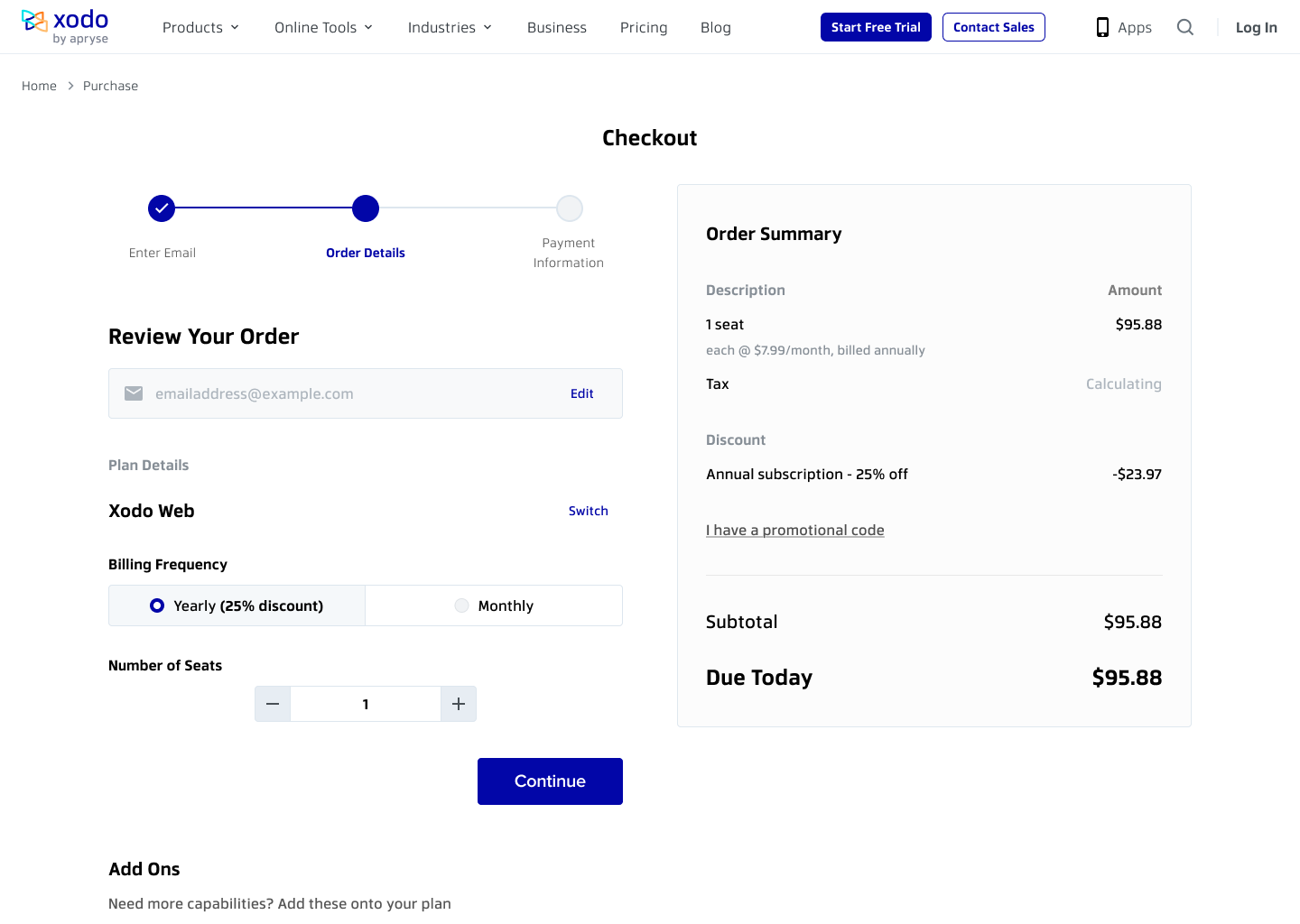
Checkout step two, option one: a horizontal three-dot progress stepper across the top reading Enter Email, Order Details and Payment Information, with billing frequency as a segmented Yearly / Monthly toggle and the order summary in a card on the right.
Option one: horizontal stepper. Progress across the top, billing as a segmented toggle. The clearest sense of position, and it spends vertical space before the cart appears.
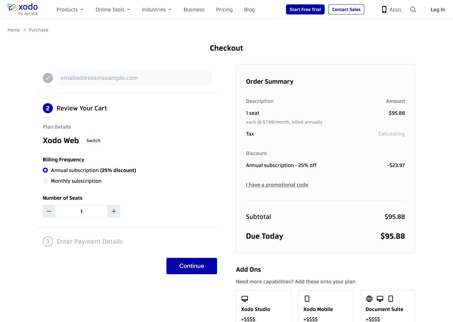
Checkout step two, option two: the three steps stacked as a numbered vertical accordion, with the completed email step collapsed to a tick and step three, Enter Payment Details, greyed below the open cart.
Option two: numbered accordion. All three steps in one column, completed ones collapsed. Shows the whole journey at once.
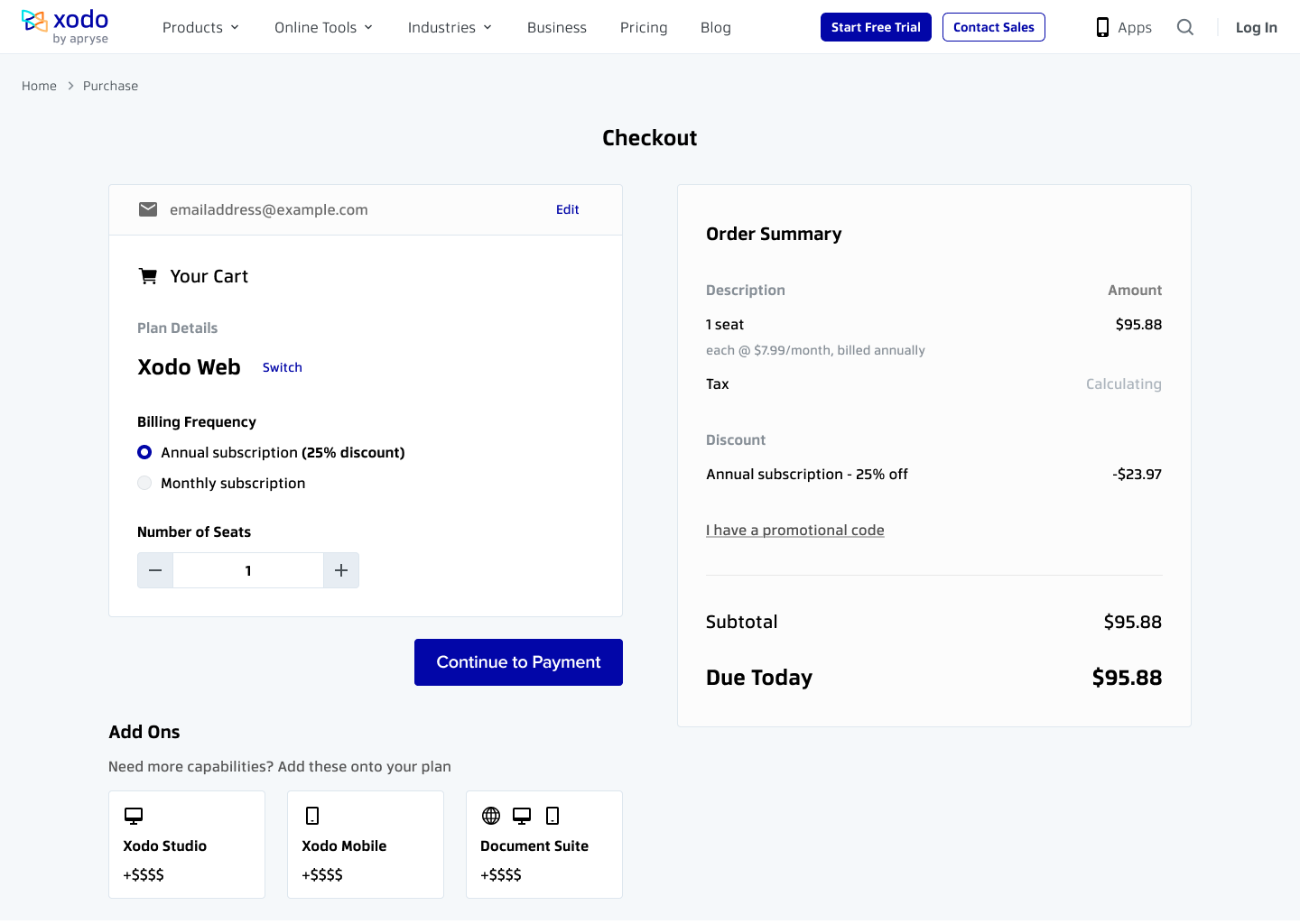
Checkout step two, option three: no stepper at all. The confirmed email and the cart sit together in a single bordered card, with an explicit Continue to Payment button beneath it.
Option three: single cart panel. No step scaffolding: email and cart in one card, with an explicit payment CTA. The fewest elements, and it loses any sense of what remains.

Evidence

Conversion more than tripled, with limits on what I can publish

Purchase conversion moved from approximately 10% to just over 30% (though we're not able to share the exact figures here), and this shift appeared to take place within roughly a month.

In terms of instrumentation available to us in this role, we had access to a cohesive ecosystem of tools including Firebase, Heap, HotJar, Sprig and StatSig.

What the number does not tell you

  • We have not published the sample size, the split, or the test design underlying that figure.
  • We measured performance across a period of approximately one month, and as such, we are only in a position to make claims about that specific window; we are not claiming that the improved conversion rate we observed necessarily held beyond that timeframe.
  • We designed the flow, and it is the flow itself that we are able to speak to directly; we are not claiming that it was necessarily the only variable that changed within the product during that period.

What shipped

It replaced the old flow across the suite

Ultimately, the streamlined flow we designed replaced the previous experience across the entire Xodo suite, and as a result, the rate at which users who began a purchase went on to complete one more than tripled, representing what is likely the most significant improvement reflected anywhere on this site. That said, the question of durability remains somewhat open: while a month was sufficient to demonstrate that a meaningful shift had occurred, it may not have been enough time to confirm that the improvement would hold over the longer term.